
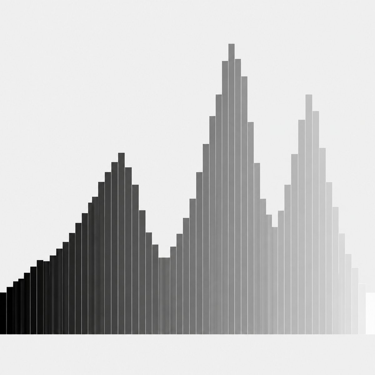


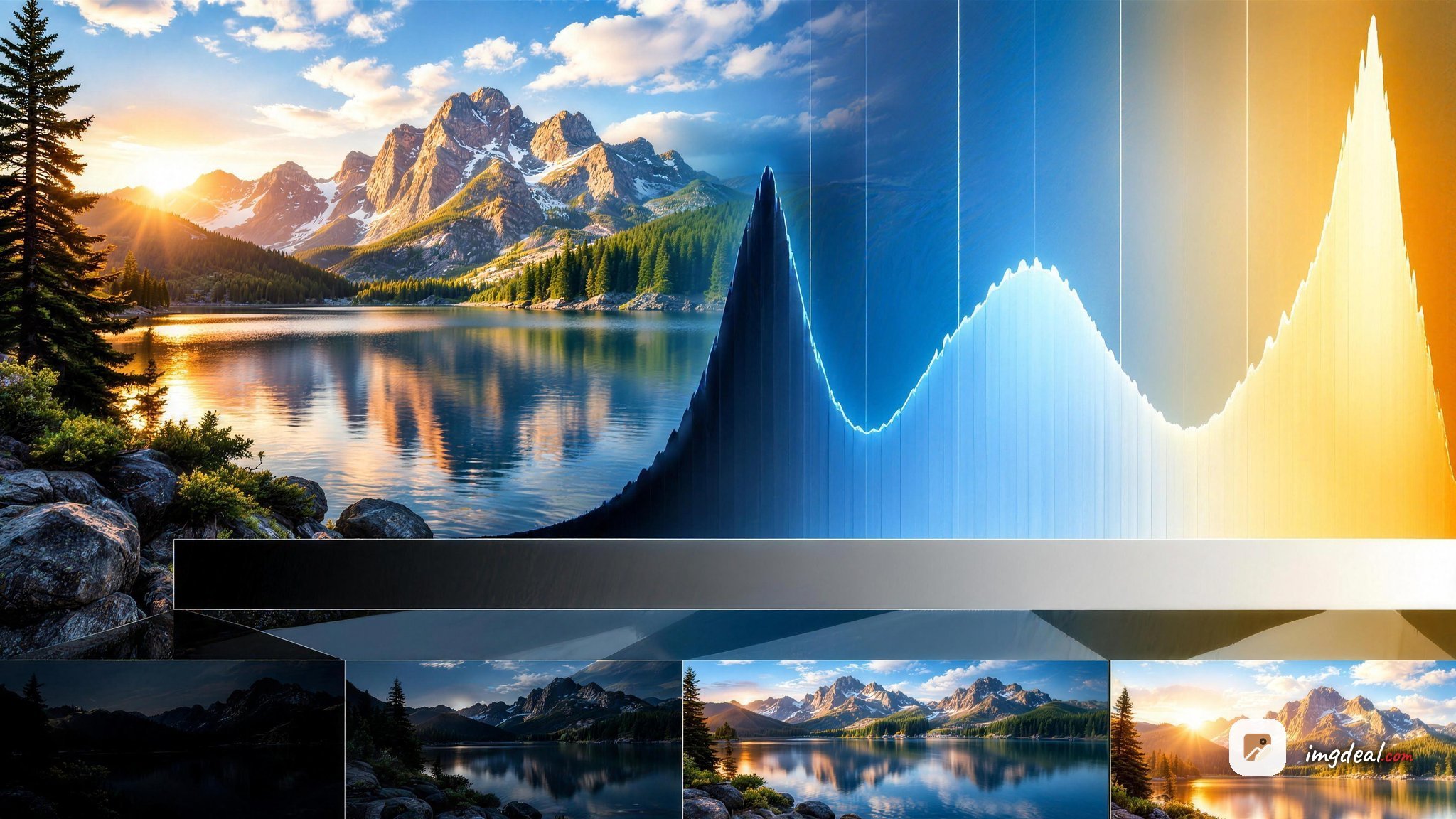
An image histogram is a bar graph that shows how the tones in your photo are spread out, from pure black on the far left to pure white on the far right. To read a histogram, you scan it left to right: peaks on the left mean lots of dark pixels (shadows), peaks in the middle mean midtones, and peaks on the right mean bright pixels (highlights). The height of each spike tells you how many pixels share that brightness level, so a tall bump means many pixels at that tone.
Content Table
What an image histogram actually shows
A histogram maps the tonal distribution of an image. The horizontal axis represents brightness levels, usually 256 of them in an 8-bit image, running from 0 (black) on the left to 255 (white) on the right. The vertical axis represents how many pixels fall at each brightness value.
It does not care where those pixels sit in your frame. A bright sky in the top corner and a bright shirt in the bottom corner both land on the right side of the graph. The histogram only counts brightness, not position.
Reading it from left to right
Split the graph into three rough zones and you have most of what you need:
- Left third: histogram shadows, the dark tones. Deep blacks, shadowed corners, night scenes.
- Middle third: midtones. Skin, grass, gray concrete, most everyday subjects live here.
- Right third: highlights. Skies, bright windows, white walls, reflections.
Where the "weight" of the graph sits tells you the overall mood of the exposure. A histogram bunched to the left is a dark, low-key image. Bunched to the right, it's a bright, high-key image. Spread evenly, it's a balanced scene with a full range of tones.
What peaks and valleys mean
Peaks and valleys are just crowds and gaps of pixels at certain brightness levels.
- A tall peak means a large area of your photo shares that exact tone. A portrait against a plain gray backdrop will spike hard in the midtones because so many pixels match that gray.
- A valley (a low or empty stretch) means few pixels have that brightness. Gaps often appear in high-contrast scenes where tones jump from dark to bright with little in between.
- Multiple peaks point to distinct tonal regions, like a dark foreground, a mid-gray subject, and a bright sky all in one frame.
None of these shapes is wrong on its own. A foggy morning naturally produces a narrow lump in the middle with almost nothing at the edges, and that's exactly how it should look. Reading histogram shapes is about matching the graph to the scene in front of you.
Spotting clipped highlights and shadows
The most useful thing a histogram tells you is when you've lost detail. This happens at the very edges.
- Clipping highlights: if data slams against the right wall and piles up, those bright pixels are pure white with zero detail. A blown-out sky or a burned-out window can never be recovered because the information was never recorded.
- Clipped shadows: data crushed against the left wall means solid black with no detail. Sometimes fine (a night sky), sometimes a problem (a face lost in shadow).
Many cameras show a "blinkies" overexposure warning that flashes clipped areas on the LCD. Pair that with the histogram and you'll catch lost detail before you leave the scene. Recovering crushed shadows in editing often introduces image noise, so getting exposure right in-camera beats fixing it later.
Is there a perfect histogram?
No. A common myth says a good exposure should form a neat bell curve centered in the middle. That's only true for average scenes. The "right" histogram depends entirely on your subject:
| Scene type | Expected histogram shape |
|---|---|
| Snowy landscape | Weighted heavily to the right, near but not touching the wall |
| Night street scene | Weighted to the left with small highlight spikes for lights |
| Foggy morning | Narrow lump in the center, empty edges |
| High-contrast sunset | Peaks at both ends with a valley in the middle |
Landscape shooters often "expose to the right," pushing the graph as far right as possible without clipping, because bright areas hold more usable data and cleaner tones. Just don't let it spill off the edge.
RGB channels and color histograms
The white histogram most cameras show blends all three color channels into a brightness reading. But you can also view separate red, green, and blue graphs. Each one shows the tonal distribution for that color.
This matters because a single channel can clip even when the combined graph looks safe. A vivid red flower or a deep blue sky might blow out just the red or blue channel, killing detail in that color while the overall exposure seems fine. Checking individual channels helps you catch color clipping and keep your tones intentional, which ties directly into building color harmony in your shots.
Histograms also show up in editing software when you push contrast, brightness, or curves. Watching the graph shift as you drag a slider is the fastest way to see whether an edit is crushing shadows or blowing highlights. If you later apply gamma correction, the whole curve stretches or compresses, and the histogram makes that change visible instantly.

Keep your tones sharp after you shrink the file
Once you've nailed exposure by reading a histogram, our Image Compressor cuts file size for JPG, PNG, and WebP while preserving the highlight and shadow detail you worked to protect.
Compress an image →
A histogram shows the tonal distribution of your image, plotting how many pixels fall at each brightness level from pure black on the left to pure white on the right. It gives you an objective read of exposure that your camera's LCD screen can't provide reliably.
Look at the far right edge. If a large, steep wall of pixels piles up against the right wall, your highlights are clipped and detail is lost to pure white. Small spikes from bright reflections are usually fine, but a big stack means overexposure you can't recover.
No. A centered bell curve only suits average scenes. A snowy field should sit to the right, a night scene to the left, and a high-contrast sunset may have peaks at both ends. The correct shape depends entirely on the scene you're photographing.
Peaks are brightness levels shared by many pixels, so a large area of one tone creates a tall spike. Valleys are levels with few pixels, common in high-contrast scenes where tones jump from dark to light. Multiple peaks signal distinct tonal regions in your frame.
The combined brightness histogram can look safe while a single color channel clips. A vivid red flower or deep blue sky may blow out just one channel, losing color detail. Viewing red, green, and blue graphs individually catches this before it ruins your colors.