

Image color correction is the process of adjusting the colors in a photo to make them accurate, balanced, and visually pleasing. Whether your shot looks too blue from office lighting, too orange from a sunset, or just flat and lifeless, color correction fixes those problems at the root level before you do anything else to the image. Think of it as giving your photo a truthful starting point.
Content Table
Color Correction vs. Color Grading
These two terms get mixed up constantly, but they mean different things and happen in a specific order.
Color correction is technical. You're fixing problems: a blue cast from fluorescent lighting, blown-out highlights, muddy shadows, or skin tones that look green. The goal is accuracy, not style. A corrected image should look like what your eye actually saw in that room or outdoors at that time of day.
Color grading is creative. Once the image is technically correct, you apply a look or mood. Teal-and-orange cinema style, warm golden-hour feel, cold desaturated thriller look. Grading is where personal style and color grading as an art form comes in.
White Balance: The Foundation of Accurate Color
White balance is the single most impactful color correction adjustment you can make. It tells the image "this is what white actually looks like under this light," and everything else shifts accordingly.
Light sources have different color temperatures, measured in Kelvin (K):
| Light Source | Color Temperature | Color Cast It Creates |
|---|---|---|
| Candle / Tungsten | 1800–3200 K | Very warm / orange |
| Sunrise / Sunset | 3000–4000 K | Warm / golden |
| Daylight / Flash | 5500–6500 K | Neutral |
| Overcast Sky | 6500–8000 K | Slightly cool / blue |
| Shade / Blue Sky | 8000–10000 K | Cool / very blue |
When your camera's white balance setting doesn't match the actual light source, you get a color cast. Shooting indoors under tungsten bulbs with "Daylight" white balance? Your photo will look orange. Fix it by either adjusting the temperature slider (pull it cooler, toward blue) or by using a custom white balance set from a neutral gray card.
Shooting in RAW format gives you full, lossless control over white balance in post. JPEG bakes the white balance in at capture, so you have less room to correct it later without quality loss.
Color Theory Basics You Actually Need
You don't need an art degree, but understanding a few color theory concepts makes correction much faster and more intuitive.
Complementary colors cancel each other out. This is the core principle behind color correction. The color wheel pairs opposites:
- Red cancels Cyan
- Green cancels Magenta
- Blue cancels Yellow
So if your photo has a yellow cast, you add blue to neutralize it. If it looks too magenta, you push green. This is exactly what the color wheel shows, and it's the logic behind every color correction slider in every editing tool.
Hue, Saturation, and Luminance (HSL) are the three properties of any color:
- Hue: The actual color (red, blue, green, etc.)
- Saturation: How vivid or muted the color is
- Luminance: How bright or dark that color appears
Most advanced editors let you adjust HSL per color channel, so you can, for example, make only the blues in a sky deeper without affecting anything else in the frame.
Key Adjustments in Image Color Correction
These are the core tools you'll use in any photo enhancement workflow, in roughly the order you should apply them:
- White Balance (Temperature + Tint): Fix the overall color cast first. Temperature moves between warm and cool. Tint moves between green and magenta. These two sliders together cover most cast problems.
- Exposure: Get the overall brightness right before touching colors. Dark images look more saturated than they actually are, and overexposed images look washed out.
- Highlights and Shadows: Recover detail in blown-out bright areas and lift detail from crushed dark areas. This affects how color reads in those zones.
- Contrast: Increases the difference between lights and darks. Adds punch but can clip color if pushed too hard.
- Curves: The most powerful correction tool. A curve lets you adjust specific tonal ranges independently. An S-curve adds contrast and richness. Pulling individual color channels (Red, Green, Blue) on a curve lets you correct casts with surgical precision.
- HSL / Color Mixer: Fine-tune individual colors. Especially useful for skin tones (orange/red channel) and skies (blue/aqua channel).
- Saturation and Vibrance: Vibrance is smarter than saturation because it boosts muted colors more than already-saturated ones, and it protects skin tones. Use vibrance for a natural photo enhancement; use saturation sparingly.
Common Color Problems and How to Fix Them
Skin Tones Look Wrong
Skin tones are the most sensitive area in any portrait. Human eyes are extremely good at detecting when skin looks off, even if they can't name why. The fix: in HSL, find the Orange and Red channels. Adjust hue slightly toward yellow-orange for warmer skin, or toward red for cooler/deeper tones. Pull luminance up slightly if skin looks too dark. Avoid pushing saturation in these channels past a natural level.
Blue Cast Indoors
Common with fluorescent or LED lighting. Pull the Temperature slider warmer (toward yellow/orange). If there's also a green tint (common with fluorescent), push the Tint slider slightly toward magenta.
Orange Cast at Night or Indoors
Caused by tungsten or warm LED bulbs. Pull Temperature cooler (toward blue). This is the most common fix for indoor photography without flash.
Flat, Lifeless Colors
Usually a combination of low contrast and low saturation. Apply a gentle S-curve to add contrast, then raise Vibrance by 10-20 points. Check that shadows aren't crushed (lift the black point slightly if needed).
Sky Looks Washed Out
In HSL, target the Blue and Aqua channels. Lower luminance to deepen the sky, and raise saturation slightly. Be careful not to make it look fake.
Tools and Workflow for Color Correction
The most widely used professional tools for image color correction are Adobe Lightroom and Camera Raw , which offer the full suite of adjustments described above in a non-destructive workflow. Capture One is a strong alternative favored by studio photographers for its color handling.
For browser-based editing without installing software, a capable image editor lets you apply crop, resize, and visual adjustments directly on an interactive canvas. If you need to clean up a photo's composition or dimensions before or after color work, a browser tool saves you from round-tripping through a desktop app just for basic edits.
A solid correction workflow looks like this:
- Set white balance first (use a gray card reference if you have one)
- Adjust exposure to get brightness in range
- Recover highlights and lift shadows
- Apply a gentle contrast curve
- Fine-tune HSL for problem color channels
- Adjust vibrance last
- Export or hand off to color grading
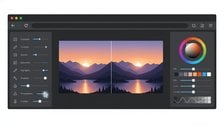
Edit and fix your photos right in the browser
Need to crop, resize, or adjust a photo as part of your image color correction workflow? Our browser-based Image Editor gives you an interactive canvas to make precise edits without installing any software.
Try the Free Image Editor →
Color correction is a technical fix. You're removing color casts, balancing white balance, and making the image look accurate to what the eye actually saw. Color grading is creative. Once the image is technically correct, you apply a mood or stylistic look, like a warm cinematic feel or a cool desaturated tone. Correction always comes first; grading builds on top of a corrected base.
Indoor lighting from tungsten bulbs or warm LEDs sits around 2700-3200 Kelvin, which is very warm. If your camera's white balance was set to Daylight (5500K), it doesn't compensate for that warmth, so everything looks orange. Fix it by pulling the Temperature slider cooler (toward blue) in your editing software until neutral surfaces like white walls look white again.
RAW gives you far more flexibility. White balance, exposure, and color adjustments are non-destructive and lossless in RAW because the data hasn't been processed yet. JPEG bakes those decisions in at capture, so you have a much smaller correction range before the image degrades. If color accuracy matters to your workflow, shoot RAW whenever your camera supports it.
Saturation raises or lowers the intensity of all colors equally, which can easily make skin tones look unnatural and already-vivid colors blow out. Vibrance is a smarter version: it boosts muted, low-saturation colors more aggressively while leaving already-saturated colors and skin tones mostly alone. For natural-looking photo enhancement, reach for Vibrance first and use Saturation only for fine-tuning.
Use HSL (Hue, Saturation, Luminance) adjustments to target specific color channels rather than the whole image. For example, if only the background has a green cast but skin tones look fine, target the Green channel in HSL and shift its hue or reduce its saturation. In Lightroom or Camera Raw, the Color Mixer panel gives you per-channel control over exactly this kind of selective correction.
A histogram shows the distribution of tones from pure black (left) to pure white (right). If the graph is piled up against the left edge, your shadows are clipped and you've lost dark detail. If it's piled against the right, highlights are blown out. Many editors also show individual RGB histograms, which reveal color imbalances: if the red channel peaks much higher than blue and green, you likely have a warm cast to correct.