


Color harmony is the practice of choosing colors that look pleasing together because they hold a specific, predictable relationship on the color wheel. When your photos feel "off" but you can't say why, it's usually a harmony problem: the colors are fighting each other instead of working as a team. Fix the relationships between hues and your images instantly read as intentional rather than accidental.
Content Table
What Color Harmony Actually Means
Color harmony comes from color theory, the study of how colors mix and interact. The core idea: colors that sit in a defined geometric relationship on the color wheel feel balanced to the human eye, while random combinations create visual tension.
Harmony is not the same as "matching." Two colors can clash and still be harmonious if they're intentionally opposite (like blue and orange). What matters is the relationship, not similarity. When that relationship is deliberate, viewers sense a plan behind the image even if they never studied a color wheel.
The Color Harmony Wheel In 30 Seconds
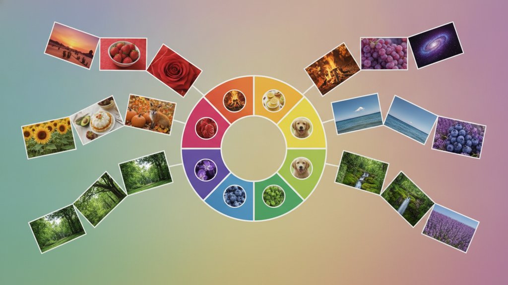
The color harmony wheel arranges hues in a circle so their relationships are visible at a glance. It's built on three tiers:
- Primary colors: red, yellow, blue. You can't mix these from other hues.
- Secondary colors: orange, green, purple. Each is a blend of two primaries.
- Tertiary colors: the six in-between shades like red-orange or blue-green.
Position on the wheel is everything. Colors next to each other feel calm and related. Colors across from each other feel high-contrast and energetic. Every harmony scheme below is just a different shape drawn across this circle. If you want the deeper mechanics of how devices actually store and display these hues, our guide to color spaces like RGB, CMYK, and sRGB explains what happens under the hood.
The Main Harmony Schemes
These are the five relationships you'll use most. Each one draws a simple shape on the wheel.
| Scheme | How it works | Best for |
|---|---|---|
| Analogous | 3 colors next to each other on the wheel | Calm, natural scenes: sunsets, forests, portraits |
| Complementary | 2 colors directly opposite | Bold contrast: a red subject on a green background |
| Split complementary | 1 base color plus the 2 neighbors of its opposite | Contrast that's softer than pure complementary |
| Triadic | 3 colors evenly spaced (a triangle) | Vibrant, playful images that stay balanced |
| Monochromatic | 1 hue in different shades and tints | Elegant, minimal, cohesive looks |
Analogous Colors
Analogous colors are the three sitting side by side, like yellow, yellow-orange, and orange. Because they share an underlying hue, they blend smoothly with almost no tension. Nature uses this constantly, which is why analogous palettes feel so relaxing. Pick one to dominate and let the other two support it rather than giving all three equal weight.
Complementary Colors
Complementary pairs sit directly across the wheel: blue/orange, red/green, yellow/purple. They create the strongest contrast possible, which is why film posters love teal-and-orange grading. The catch is intensity. Use one as the star and the other as an accent, or the image starts to vibrate uncomfortably.
Split Complementary
Split complementary keeps the punch of a complementary scheme but softens it. Instead of pairing blue with pure orange, you pair blue with the two colors flanking orange (red-orange and yellow-orange). You still get contrast, but with more room to breathe and fewer chances of a jarring clash.
Triadic Color Scheme
A triadic color scheme uses three hues spaced evenly, forming a triangle: red, yellow, blue is the classic example. It's vibrant and balanced at the same time. To keep it from feeling like a circus, let one color lead and mute or shrink the other two.
Applying Harmony To Real Photos
You rarely control every color in a photo, so harmony in photography is mostly about editing and framing. Practical moves:
- Shoot with harmony in mind: place a warm subject against a cool background for instant complementary contrast.
- Grade toward a scheme: push shadows one direction and highlights another (cool shadows, warm highlights is the everyday version of complementary grading).
- Fix the base first: harmony falls apart if your colors are simply wrong. Nail your white balance correction before you start creative grading, so a color cast isn't sabotaging the palette.
- Balance the whole image: good image color balance and correction gives you a neutral starting point to build a scheme on top of.
- Reduce competing colors: desaturate distractions so your chosen palette stands out.
A fast test: squint at your photo until details blur. If the remaining color blobs feel organized, your harmony is working. If they feel scattered, one hue is probably out of place.
Common Harmony Mistakes
- Equal weighting: giving every color the same amount of space kills the hierarchy. Always pick a lead.
- Too many hues: more than three or four dominant colors usually reads as noise. Simplify.
- Ignoring saturation: harmony isn't only about hue. Two harmonious hues at clashing saturation levels still fight.
- Forcing a scheme: if a scene is naturally analogous, don't jam in a complementary accent just because a tutorial said to.
- Chasing trends blindly: teal-and-orange works, but not on every photo. Match the scheme to the mood you want.
Harmony is a tool, not a rulebook. Once you can name the relationship you're using, you can also decide when breaking it serves the image better.

Keep your color harmony intact across formats
Once you've dialed in a color scheme, converting between formats can shift your palette. Our free image converter helps you move between formats while preserving the color harmony you worked to build.
Convert an image →
Color harmony means choosing colors that hold a defined relationship on the color wheel so they look balanced together. It's less about colors being similar and more about the relationship being intentional, whether that's colors sitting side by side or directly opposite each other.
There's no single best scheme. Analogous palettes suit calm, natural scenes, while complementary pairs like blue and orange add bold contrast. For portraits and landscapes, most editors reach for complementary or split complementary grading because it separates the subject from the background cleanly.
Complementary uses two colors directly opposite on the wheel for maximum contrast. Split complementary swaps one of those for the two colors flanking it, giving you similar contrast with a gentler, less jarring result that's easier to balance in a busy photo.
Yes. A color cast from bad white balance distorts every hue in your photo, so any harmony scheme you build on top will look off. Correct white balance and overall color balance first, then apply creative grading to a clean, neutral starting point.
Absolutely. More than three or four dominant hues usually reads as visual noise. The fix is hierarchy: pick one lead color for roughly 60% of the frame, a support color for 30%, and an accent for 10%, then desaturate any competing distractions.