
Aspect ratio is the proportional relationship between an image's width and its height, and it determines the shape of your image far more than the number of pixels does. You can have a stunning 20-megapixel photo that looks completely wrong on a website because the crop ratio doesn't match the container it lives in. Resolution tells you how much detail is packed in; aspect ratio tells you what shape that detail takes.
Content Table
What Is Aspect Ratio, Exactly?
An aspect ratio is written as two numbers separated by a colon, like 16:9 or 4:3 . The first number is the width, the second is the height. A 16:9 image is 16 units wide for every 9 units tall. Those units could be pixels, inches, centimeters — it doesn't matter. What matters is the proportion.
A 1920x1080 pixel image and a 1280x720 pixel image are both 16:9. They have very different resolutions, but they are the exact same shape. Scale one up or down and it fits perfectly where the other fits. That's the power of thinking in ratios rather than raw pixel counts.
Ratio vs. Resolution: Why Shape Wins
Resolution is about quality. Aspect ratio is about fit. When an image doesn't match the space it's placed in, one of two things happens: it gets cropped (parts get cut off) or it gets letterboxed (black bars appear on the sides or top and bottom). Neither is ideal, and both are entirely caused by an aspect ratio mismatch, not a resolution problem.
Here's a concrete example. You shoot a portrait photo on your phone in 4:5 (a common Instagram format). You then try to use it as a YouTube thumbnail, which requires 16:9. The thumbnail tool will either squish your image horizontally, add black bars on the sides, or crop the top and bottom off your subject's face. More megapixels won't fix any of that. Only matching the ratio fixes it.
This is why professional photographers think about the final destination of an image before they even press the shutter. A photo destined for a billboard needs different framing than one going into a square Instagram post, even if both are shot on the same camera at the same resolution.
Common Aspect Ratios and Where They Live
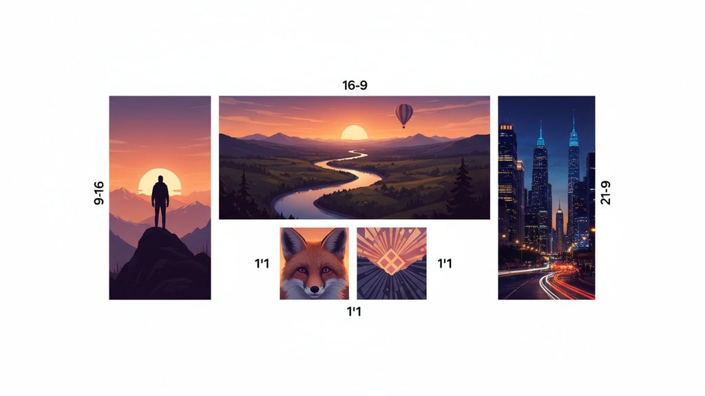
| Aspect Ratio | Common Name | Typical Use Case |
|---|---|---|
| 1:1 | Square | Instagram feed posts, profile photos, album art |
| 4:3 | Classic TV / Standard | Older monitors, print photos (4x3 inch), iPad video |
| 16:9 | Widescreen | YouTube, HD/4K video, most desktop monitors, presentations |
| 4:5 | Portrait / Reel | Instagram Reels, portrait-oriented feed posts |
| 9:16 | Vertical / Story | Instagram Stories, TikTok, YouTube Shorts, Snapchat |
| 3:2 | DSLR Standard | Most DSLR and mirrorless camera sensors, 4x6 inch prints |
| 21:9 | Ultrawide / Cinematic | Ultrawide monitors, cinematic film, anamorphic lenses |
Notice that 9:16 is just 16:9 flipped on its side. When smartphones became the primary camera for most people, vertical video went from a social faux pas to the dominant format on TikTok and Instagram. The ratio didn't change; the orientation did.
16:9 vs. 4:3: The Ratio That Changed Everything
For most of television history, screens were 4:3. That's nearly square, which matched how analog broadcast signals were structured. In the early 2000s, the global transition to 16:9 widescreen was a deliberate industry decision driven by the ITU-R BT.709 HDTV standard , which locked in 16:9 as the format for high-definition television.
The key difference in practice:
- 4:3 feels boxy and tall. It's great for portraits and documents. A printed 4x6 photo is actually 3:2, but a 4x3 inch photo print is common and feels "traditional."
- 16:9 matches human peripheral vision more closely. Our eyes see a wider field horizontally than vertically, which is why widescreen cinema feels more immersive.
- Converting 4:3 footage to 16:9 without cropping creates pillarboxing (black bars on the sides). Converting 16:9 to 4:3 without cropping creates letterboxing (black bars on top and bottom).
If you're repurposing old photos or footage shot in 4:3 for a modern 16:9 platform, you have a real decision to make: crop and lose some content, or accept the bars. There's no lossless conversion between different aspect ratios.
How Photo Dimensions and Crop Ratio Work Together
Photo dimensions (like 4032x3024 pixels) are a specific instance of an aspect ratio. That particular size is 4:3. When you know the ratio, you can scale the image to any resolution that maintains it: 800x600, 1024x768, 2048x1536 all preserve the 4:3 shape.
Where people run into trouble is when they need to change the ratio, not just the size. Resizing keeps the ratio. Cropping changes it. If you resize a 4:3 image to fit a 16:9 container without cropping, the image will be distorted (stretched or squished). The only correct solution is to crop first, then resize.
If you're preparing images for print, the ratio matters just as much. A standard 4x6 print is 3:2. A 5x7 is roughly 5:7. If you send a 1:1 square photo to a 4x6 print lab, they'll either add white borders or crop your image. Knowing your target print dimensions and matching the crop ratio before sending saves a lot of frustration. For more on preparing images for print, see our guide on fixing low-resolution photos before printing .
How to Crop to a Specific Aspect Ratio
Cropping to a specific ratio means you need to decide two things: which ratio to target, and which part of the image to keep. That second part is called the anchor point.
For example, if you crop a wide landscape photo to 1:1 (square) using a center anchor, you'll keep the middle section. If you use a left anchor, you'll keep the left side. If your subject is on the right side of the frame, center and left anchors will cut them out.
Here's how to crop images to a specific aspect ratio using imgdeal's Image Cropper:
- Open Image Cropper from the Tools menu (Edit group).
- Drop up to 50 images (batch processing is supported).
- Select a target ratio from the presets: Original , Square 1:1 , Story 9:16 , Reel 4:5 , or Widescreen 16:9 .
- Choose an anchor point to control which part of the image is preserved. Options: center , top , bottom , left , right . Default is center.
- Click crop and download your results.
For pixel-precise cropping where you need to define an exact region rather than a ratio, the Image Editor lets you drag crop handles to set exact x, y, width, and height coordinates. This is useful when you need to crop to a specific pixel dimension rather than a proportional ratio.
Understanding aspect ratio also intersects with file format choices. Some formats handle transparency or color differently, which can affect how your cropped image looks on different backgrounds. Our ultimate guide to image formats covers when to use JPG, PNG, WebP, and AVIF so your cropped images look right everywhere they land.
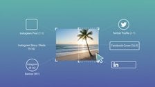
Crop to the exact aspect ratio your platform needs
Whether you need 16:9 for YouTube, 9:16 for Stories, or 1:1 for a square feed post, imgdeal's Image Cropper lets you set the ratio, pick your anchor point, and batch-process up to 50 images at once — no guessing, no black bars.
Try the Image Cropper →
Cropping to a new aspect ratio does not reduce the quality of the pixels that remain. It simply removes pixels outside the cropped area. You will end up with a smaller image (fewer total pixels), but the sharpness and quality of what's left is unchanged. Stretching or squishing an image to fit a new ratio without cropping is what causes visible quality loss.
It depends on the format. Instagram feed posts support square (1:1), portrait (4:5), and landscape (1.91:1). Reels use 4:5 for the feed thumbnail and 9:16 for the full vertical view. Stories and Reels in full-screen are 9:16. The 4:5 portrait ratio is generally recommended for feed posts because it takes up the most vertical screen space, which tends to increase engagement.
Divide both the width and height by their greatest common divisor (GCD). For a 1920x1080 image, the GCD is 120. So 1920/120 = 16 and 1080/120 = 9, giving you 16:9. You can also just divide width by height to get a decimal (1920/1080 = 1.78) and match it to known ratios: 1.78 is 16:9, 1.33 is 4:3, 1.0 is 1:1.
Black bars appear because your video or image has a different aspect ratio than your TV screen. Most modern TVs are 16:9. If your content is 4:3 (older footage), you'll see vertical black bars on the sides (pillarboxing). If your content is ultra-wide 21:9, you'll see horizontal bars on the top and bottom (letterboxing). The TV is preserving the original proportions rather than stretching the image.
Resolution refers to the total number of pixels in an image (e.g., 1920x1080 or 12 megapixels) and determines how sharp and detailed it looks. Aspect ratio is the proportional relationship between width and height (e.g., 16:9) and determines the shape of the image. Two images can share the same aspect ratio but have completely different resolutions, and vice versa.
Most modern smartphones default to 4:3 for photos (inherited from traditional photography) and 16:9 or 9:16 for video depending on orientation. Many flagship phones (iPhone 15, Samsung Galaxy S24) also offer a 1:1 square mode and some offer full sensor readout in different ratios. Check your camera settings, as the default ratio affects how much of the sensor is used and the final pixel dimensions.