
Image dithering is a technique that uses patterns of pixels to simulate colors or tones that aren't available in a limited palette, and it genuinely helps your photos look better in specific situations. When you reduce an image to fewer colors, like converting a photo to an 8-bit GIF or a low-color PNG, dithering prevents the flat, banded look you'd otherwise get. Instead of harsh jumps between colors, you get a smoother, more natural result that tricks the eye into seeing gradients that technically aren't there.
Content Table
What Image Dithering Actually Does
Your monitor can display millions of colors. A standard 24-bit image stores up to 16.7 million distinct color values. But many image formats, especially GIFs and certain PNGs, work with a palette of 256 colors or fewer. When you squash a full-color photo into that palette, something has to give.
Without dithering, the software just picks the nearest available color for each pixel. That works fine for flat graphics with solid fills, but photographs contain smooth gradients, skin tones, and subtle sky transitions that need thousands of intermediate shades to look right. Strip those away and you get color banding, which looks like a poster with abrupt color blocks instead of smooth transitions.
Dithering solves this by distributing the "error" (the difference between the ideal color and the nearest available color) across neighboring pixels. The result is a fine, intentional pattern of different-colored pixels that, when viewed at normal size, blends together visually. Your brain averages the dots and perceives a color that isn't actually in the palette.
The Posterization Problem Dithering Solves
Image posterization is what happens when a continuous-tone image gets reduced to too few color levels. You lose the subtle mid-tones, and the image snaps into distinct flat regions. A blue sky gradient turns into three or four visible stripes of blue. A face with soft shadow transitions develops harsh edges that weren't there before.
Posterization happens in two main scenarios:
- Aggressive color reduction: Saving a photo as a GIF with 32 or 64 colors instead of 256.
- Heavy lossy compression: JPEG compression at very low quality settings can also introduce banding in smooth gradients, though the mechanism is different (DCT block artifacts rather than palette limits).
Dithering directly addresses the first scenario. It can't fix JPEG block artifacts, but for any palette-based format where you're limiting the number of available colors, it's the primary tool for maintaining perceived quality.
The Wikipedia entry on posterization explains the visual effect well if you want to see side-by-side examples of what banding actually looks like versus a smooth gradient.
Common Dithering Algorithms and How They Differ
Not all dithering is the same. Different dithering algorithms produce very different visual textures, and choosing the right one matters depending on your image content.
| Algorithm | How It Works | Best For | Downside |
|---|---|---|---|
| Floyd-Steinberg | Spreads quantization error to four neighboring pixels using a weighted formula | Photographs, smooth gradients | Can create a "worm" pattern on flat areas |
| Ordered (Bayer matrix) | Uses a fixed threshold matrix to place dots in a regular grid pattern | Retro aesthetics, pixel art, icons | Visible repeating pattern, less natural on photos |
| Atkinson | Spreads only 3/4 of the error, producing higher contrast results | Line art, high-contrast images | Loses shadow/highlight detail in photos |
| Stucki / Jarvis | Distributes error across more neighbors than Floyd-Steinberg | Photographs needing smoother output | Slightly slower, can soften fine detail |
Floyd-Steinberg is the default in most image editors and compression tools because it handles photographic content well. It was introduced by Robert W. Floyd and Louis Steinberg in a 1976 paper and remains the most widely used error-diffusion method today.
When Dithering Genuinely Helps Your Photos
Dithering earns its keep in specific, well-defined situations. Here's when turning it on is clearly the right call:
- Saving photos as GIF: GIF is limited to 256 colors maximum. Any photograph with gradients, skin tones, or sky will show heavy banding without dithering. Enabling dithering when you optimize a GIF palette is almost always worth the small file size increase.
- Reducing a PNG to an indexed palette: 8-bit PNG files use a color table just like GIF. If you're converting a 24-bit PNG to 8-bit for smaller file sizes, dithering preserves the appearance of smooth transitions.
- Thumbnails and small images: At small sizes, you have fewer pixels to work with. Dithering helps maintain tonal range even when the palette is constrained.
- Images with large sky areas or soft backgrounds: These are the most sensitive to banding. Dithering makes a visible difference on blue-sky gradients, foggy backgrounds, and sunset photos.
- Animated GIFs: Each frame of an animated GIF has its own palette. Dithering each frame reduces the jarring color shifts that happen when palette colors change between frames.
When Dithering Makes Things Worse
Dithering isn't universally beneficial. There are clear cases where it actively hurts image quality or creates new problems:
- Flat graphics, logos, and icons: These images have solid fills and sharp edges by design. Dithering introduces noise into areas that should be clean and flat. A company logo with a solid red background will look grainy if dithered.
- Screenshots and UI graphics: Text, buttons, and interface elements need crisp, clean edges. Dithering softens those edges and makes text harder to read.
- Images that will be upscaled: Dithering patterns that look fine at 100% zoom become very visible and ugly when the image is enlarged. If you're creating assets that might be scaled up later, avoid dithering.
- When file size matters more than gradients: Dithered images are harder to compress. The random-looking pixel patterns created by error-diffusion dithering don't compress as efficiently as flat color areas. If you need the smallest possible file and the image doesn't have critical gradients, skip dithering.
Dithering in GIF and Color Reduction Workflows
The most practical place you'll encounter dithering decisions is when working with GIFs and palette-limited images. When you reduce the number of colors in an image, you're making a trade-off between file size and visual fidelity. Dithering is the tool that lets you push that trade-off further toward smaller files without making the image look terrible.
Here's how the interaction works in a typical color reduction workflow:
- You start with a full-color image (thousands or millions of colors).
- A color quantization algorithm picks the best representative palette (for example, 256 colors using an adaptive palette).
- Each pixel gets assigned to its nearest palette color. This creates the quantization error.
- With dithering enabled, that error gets distributed to neighboring pixels, smoothing out the transitions visually.
- Without dithering, the error is simply discarded, and banding appears.
The max colors setting is directly tied to dithering effectiveness. At 256 colors, dithering has enough palette entries to work with and produces excellent results. At 16 colors, even good dithering can't fully compensate for the severe palette limitation, though it still helps. The sweet spot for photographic GIFs is usually 128 to 256 colors with dithering enabled.
Tools that handle GIF optimization properly let you control both the palette size and whether dithering is applied. The combination of adaptive color quantization plus error-diffusion dithering is what separates a good-looking GIF from a blocky, banded one. For a deeper technical look at how color quantization works alongside dithering, the GIF89a specification describes the palette structure that makes all of this necessary in the first place.
One practical note: if you're optimizing GIFs for web use, the goal is usually to reduce the max color count as far as possible while dithering keeps the result visually acceptable. Dropping from 256 to 128 colors on a photographic GIF with dithering enabled often saves 15 to 25% in file size with barely noticeable quality loss. Dropping to 64 colors with dithering can still look reasonable for images without fine detail.
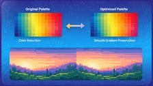
Compress GIFs and palette-limited images without the banding
Our Image Compressor handles GIF palette optimization with adaptive color reduction, so you can control max colors and squeeze file sizes while image dithering keeps your gradients looking smooth instead of posterized.
Try Our Free Image Compressor →
Dithering generally increases file size slightly for palette-based formats like GIF and 8-bit PNG. The varied pixel patterns created by error-diffusion dithering are harder for lossless compression algorithms to compress than flat solid-color regions. For photographic images where you need the dithering, the size increase is usually worth the visual improvement. For flat graphics or logos, skip dithering entirely to keep files as small as possible.
No, JPEG does not use dithering. JPEG compression works through a completely different mechanism called Discrete Cosine Transform (DCT), which divides the image into 8x8 pixel blocks and discards high-frequency detail. The artifacts from heavy JPEG compression look like blocky smearing or ringing around edges, not the dot patterns from dithering. Dithering is specific to palette-based formats where a limited color table is the constraint.
They solve related but different problems. Anti-aliasing smooths jagged edges along diagonal lines and curves by blending edge pixels with the background color. It addresses the staircase effect from pixel grids. Dithering addresses color depth limitations by simulating colors not available in a restricted palette. Anti-aliasing is applied during rendering or scaling. Dithering is applied during color quantization or palette reduction. Both improve perceived image quality, but in different ways.
Not cleanly, no. Once dithering has been baked into an image and saved, the original smooth gradient information is gone. What remains is the dithered pixel pattern. You can apply a blur or noise-reduction filter to soften the pattern, but you'll lose sharpness in the process and the result won't match the original. The best approach is always to keep the original full-color source file and re-export with different settings if you want to change the dithering behavior.
Mostly yes for typical web photos, but not entirely. GIF and 8-bit PNG are the main formats where dithering decisions matter today. However, dithering also appears in display technology (some monitors use temporal dithering to simulate more bit depth than the panel actually has), in print workflows, and in certain embedded or low-memory device displays that can only render a limited color range. For everyday JPEG and WebP photography, dithering is not a factor.
Floyd-Steinberg is the best default choice for photographic GIFs. It distributes quantization error across neighboring pixels in a way that handles smooth gradients and skin tones well. Stucki or Jarvis dithering can produce slightly smoother results on some images but are slower to process. Ordered (Bayer) dithering is better suited for pixel art or retro aesthetics than for photographs. When in doubt, start with Floyd-Steinberg and compare the result visually before trying alternatives.