
Posterization is an image processing technique that reduces the number of tones or colors in a photo down to a small, fixed set, creating bold, graphic bands of flat color instead of smooth gradients. The result looks like a screen-printed poster or a hand-painted illustration — which is exactly where the name comes from. When you apply the posterize effect to a photograph, you strip away thousands of subtle color variations and replace them with a handful of decisive, high-contrast blocks.
Content Table
How Posterization Works
A typical digital photograph contains millions of distinct color values. Each pixel's color is stored as a combination of red, green, and blue values, each ranging from 0 to 255 in an 8-bit image. That gives you over 16 million possible colors. Smooth gradients in sky, skin, or shadow exist because neighboring pixels shift by just one or two values at a time.
Posterization collapses that range. Instead of 256 possible values per channel, you might allow only 4 or 6. Every pixel's original value gets rounded to the nearest permitted level. A sky that once transitioned through 80 shades of blue now shows three: a dark blue, a mid blue, and a pale blue. The transitions between those bands are abrupt, which creates the characteristic "stepped" look.
Tonal Posterization Explained
Tonal posterization specifically refers to reducing the number of brightness levels in an image, rather than targeting hue or saturation directly. Think of it as working on the luminosity channel. When you reduce tonal levels, you flatten the gradual light-to-dark transitions in a photo into distinct steps.
This is different from simply converting to grayscale or adjusting contrast. Tonal posterization preserves the general shape of light and shadow but removes all the in-between nuance. A face lit from one side might show three distinct zones: bright highlight, flat midtone, and deep shadow, with hard edges between them. That's what gives posterized portraits their graphic, almost stencil-like quality.
In software like Adobe Photoshop, the Posterize adjustment layer works on tonal values per channel. Setting it to 4 levels means each channel (R, G, and B) is reduced to 4 steps, giving you up to 64 possible color combinations (4 × 4 × 4) rather than 16 million.
Color Banding vs. Posterization
These two terms describe the same visual artifact but in very different contexts. Understanding the difference matters a lot depending on whether you're creating an effect or troubleshooting a problem.
| Aspect | Posterization (intentional) | Color Banding (unintentional) |
|---|---|---|
| Origin | Applied deliberately as a creative effect | Caused by bit depth limitations or compression |
| Appearance | Bold, graphic, high-contrast color blocks | Visible stripes in smooth gradients (sky, shadows) |
| Control | Fully adjustable (number of levels) | Unwanted; requires correction |
| Common fix | N/A (it's the goal) | Use higher bit depth or image dithering |
Color banding is what happens when a gradient that should be smooth is forced through too few tonal steps, usually because the image is saved at low bit depth (like 8-bit after editing in 16-bit), exported with heavy compression, or displayed on a screen with limited color output. The visual result looks similar to posterization, but it's an accident rather than a choice.
Color Quantization: The Math Behind It
Color quantization is the underlying process that makes posterization possible. It's the algorithm that decides how to map a large set of colors down to a smaller, limited color palette. When you posterize an image, you're running a form of color quantization under the hood.
There are several quantization methods, each with different trade-offs:
- Uniform quantization: Divides the color space into equal-sized buckets. Simple and fast, but can produce poor results when most colors cluster in one region of the spectrum.
- Median cut: Splits the color space based on where the most colors actually live, producing a more representative limited palette. Used in older GIF conversion workflows.
- K-means clustering: Groups similar colors together mathematically and represents each group with its average. More accurate, more computationally expensive.
- Octree quantization: Builds a tree structure from the color data and prunes it to hit the target palette size. Common in image editors and format converters.
The choice of quantization method directly affects how "artistic" or how "noisy" the posterized result looks. A uniform quantization on a sunset photo might produce garish results because it doesn't account for where the actual colors are concentrated. K-means or octree methods tend to produce more visually coherent limited palettes.
If you've ever converted an image to GIF format, you've already encountered color quantization in action. GIF supports a maximum of 256 colors, so the converter must reduce your photo's millions of colors to that palette. The result is a form of posterization, sometimes softened by dithering techniques that simulate missing tones using patterns of available colors.
When Posterization Is Intentional
Artists and designers reach for the posterize effect deliberately in a lot of contexts:
- Screen printing preparation: Traditional screen printing uses separate ink layers, one per color. Posterizing a photo down to 4-6 colors maps it directly to a printable screen-print layout.
- Graphic design and branding: Flat-color illustrations are a major design trend. Posterizing a photo gives it a stylized, editorial feel without requiring hand-drawn illustration skills.
- Political and protest art: The Shepard Fairey "Hope" poster of Barack Obama is one of the most recognized examples of posterization applied to a photograph, reducing it to four flat colors for maximum visual impact.
- Retro and lo-fi aesthetics: Limited color palettes evoke early digital graphics, risograph printing, and vintage offset lithography.
- Animation and comics: Cel-shading in 3D animation is essentially real-time tonal posterization applied to rendered objects.
When Posterization Is a Problem
Unintentional posterization shows up most often in these situations:
- Aggressive JPEG compression: High compression discards color information, which can cause banding in smooth gradients like blue skies or out-of-focus backgrounds.
- 8-bit export after 16-bit editing: If you edit in a 16-bit color space (which gives you 65,536 values per channel) and then export to 8-bit (256 values per channel), subtle gradients can band visibly.
- Low-quality displays: Screens with limited color depth (older TN panels, for example) can display banding even when the image file itself is fine.
- Extreme brightness or contrast adjustments: Stretching or compressing the tonal range of an image can expose gaps in the color data, making banding visible where it wasn't before.
If you're seeing unwanted banding in photos you're preparing for print, it's worth checking the resolution and color depth of your files before printing to rule out source-file issues before blaming the printer.
Color accuracy problems sometimes get confused with posterization. If your image looks flat or the tones seem off rather than banded, the issue might be white balance or color temperature rather than quantization.
How to Posterize an Image
The general workflow is the same across most image editors, even though the exact menus differ:
- Open your image in your editor of choice. For best results, start with a high-resolution photo with good tonal range.
- Convert to the right color mode. RGB is standard for screen output. If you're preparing for print, you may want to work in CMYK, though posterization in CMYK can produce unexpected results because the channel math differs.
- Apply the posterize adjustment. In Photoshop, go to Image > Adjustments > Posterize (or add a Posterize adjustment layer for non-destructive editing). In GIMP, it's Colors > Posterize. Most tools ask you to set a "levels" value.
- Choose your level count. Start with 4 levels for a strong graphic effect. Go up to 6-8 for something more subtle. Go down to 2-3 for maximum abstraction.
- Refine manually. After posterizing, you can select individual color regions and adjust their hue, brightness, or saturation to match a specific palette or brand color set.
- Export appropriately. PNG preserves flat colors perfectly without introducing new compression artifacts. JPEG at high quality also works but may re-introduce slight banding at the color edges.
Portraits tend to produce the most dramatic and recognizable posterized results because faces have strong tonal contrast. Landscapes with wide skies and flat horizons also work well. Busy, textured images (like close-ups of fabric or foliage) can look muddy because too many similar tones compete for the same color slot.
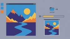
Convert Posterized Images Without Ruining the Effect
When you're working with a limited color palette and flat posterize effect, format conversion matters. Our image converter helps you move between formats while keeping those crisp, banded colors intact.
Convert Your Image →
For a bold, graphic poster look, 3 to 4 levels is the sweet spot. At 2 levels you get an almost binary effect with very little color variation. At 6 to 8 levels the effect becomes subtle and may not read clearly as intentional posterization. Start at 4, preview the result, and adjust from there based on how much detail you want to preserve in the image.
Yes, significantly, especially when saved as PNG. PNG uses lossless compression that works much more efficiently on flat areas of solid color than on complex photographic gradients. A posterized image saved as PNG can be dramatically smaller than the original photo. Saving as JPEG also benefits because there's less color variation for the compression algorithm to encode, though JPEG may introduce slight artifacts at color edges.
No. Grayscale conversion removes all color information and maps everything to shades of gray. Posterization reduces the number of available tones but keeps the color information intact. You can posterize a color image and still end up with a range of distinct colors, just fewer of them. You can also posterize a grayscale image, which gives you a limited number of gray levels rather than a full gradient from black to white.
Skin tones occupy a relatively narrow band of the color spectrum, so when you reduce the number of available tones, the transitions between highlight, midtone, and shadow on a face can look harsh or unnatural. The fix is usually to increase the posterize level slightly (try 5 or 6 instead of 3), or to apply the effect selectively, using a lower level on the background and a higher level on the face to preserve more facial detail.
Posterization reduces the number of tonal levels, creating flat color bands. Solarization (also called the Sabattier effect) partially reverses the tones in an image, so highlights become dark and shadows become light in certain zones. The two effects look very different. Solarization creates a ghostly, surreal inversion effect, while posterization creates a bold, simplified graphic look. Both are classic darkroom techniques now replicated digitally.
No. Once you flatten and save a posterized image, the original color data is permanently discarded. The pixels that used to hold thousands of color values now only contain the reduced set. There is no way to recover the original gradient information from the saved file. This is why working non-destructively, using adjustment layers in Photoshop or keeping the original file separate, is strongly recommended before committing to the effect.