


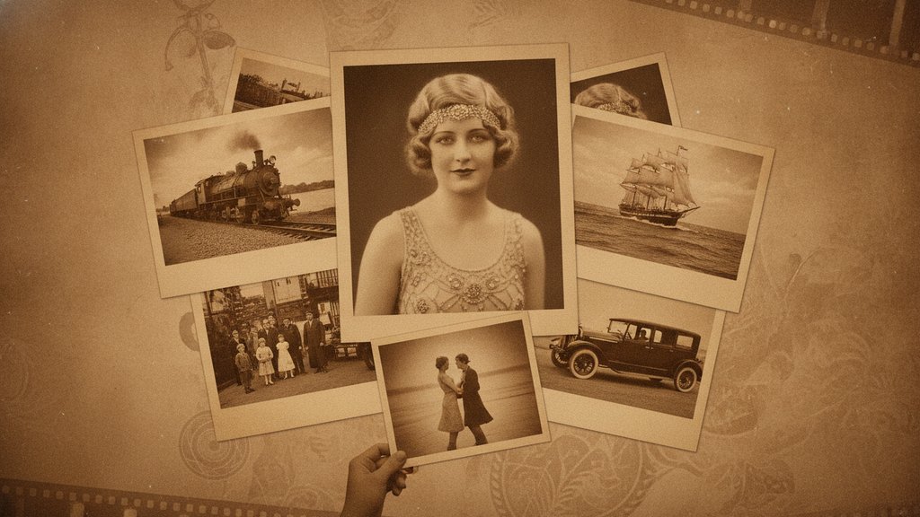
Sepia is that warm, reddish-brown tint you see on old photographs, the color of faded family portraits and cowboy-era snapshots. In photography, "sepia" refers to a monochrome tone that replaces the usual grays of a black-and-white image with soft brown hues, giving photos a vintage, timeless feel. Originally it came from a real pigment made from cuttlefish ink, but today it's a color grading style photographers apply on purpose to add warmth and nostalgia.
Content Table
What Sepia Actually Is
At its core, sepia is a single-color image built from shades of brown instead of shades of gray. A normal grayscale photo runs from pure black to pure white with neutral grays in between. A sepia image keeps that same range of light and dark, but shifts every tone toward a warm brown-orange.
The word itself comes from the Greek word for cuttlefish. That's not a coincidence, and we'll get to why in a moment. What matters for photographers is that sepia is not just "an old filter." It's a specific hue applied evenly across the luminosity of a picture, which is why it reads as intentional and elegant rather than accidental.
Where Sepia Came From
The original sepia pigment was made from the ink sac of the common cuttlefish, a squid-like sea creature. Photographers in the 1800s used a sepia toning process on black-and-white prints for a very practical reason: it made the photos last longer.
Here's what actually happened chemically:
- A silver print was treated in a toning bath that converted the metallic silver into a more stable silver sulfide compound.
- That conversion turned the image brown and made it far more resistant to fading and environmental damage.
- Many surviving 19th-century photographs look brown today because they were sepia-toned, which is exactly why the color reads as "old" to our eyes.
So sepia wasn't originally an artistic choice. It was archival protection. The vintage look is a happy side effect that we've since fallen in love with.
How the Sepia Tone Effect Works
Modern sepia is done digitally, and the process is straightforward once you understand it happens in two steps.
- Convert to grayscale. The software strips out the original colors and keeps only brightness values, so you have a clean black-and-white base.
- Apply a warm color map. Each brightness level gets tinted toward brown. Highlights become creamy tan, midtones turn warm brown, and shadows deepen into dark chocolate.
A common digital recipe applies fixed weights to the red, green, and blue channels of each pixel. Red gets boosted the most, green sits in the middle, and blue is pulled down hardest, which produces that characteristic warm cast. Because the effect depends on brightness, understanding how tone values are stored matters. If you want to go deeper on how brightness is encoded in an image, our guide to image gamma correction explains the math behind those tonal shifts.
Sepia is closely related to other tone-mapping styles. If you like the idea of pushing an image into simplified color zones, you might also enjoy reading about posterization, which reduces an image to a small set of flat tones instead of a single warm hue.
Sepia vs Black and White
People often lump these two together, but they create very different moods. Both are monochrome, meaning they use one tonal range instead of full color, but the emotional result is not the same.
| Aspect | Sepia | Black and White |
|---|---|---|
| Color base | Warm brown tones | Neutral gray tones |
| Mood | Nostalgic, soft, romantic | Dramatic, timeless, stark |
| Feels like | A memory or a keepsake | A bold artistic statement |
| Best for | Portraits, heritage, rustic scenes | High contrast, street, fine art |
Black and white leans on pure contrast and shadow to feel powerful. Sepia softens that same contrast with warmth, which is why it feels gentle and sentimental rather than intense. If you're choosing between them for a photo, ask yourself whether you want the image to feel like a strong statement (black and white) or a cherished memory (sepia).
Why Photographers Still Use Sepia
Sepia has survived the jump from darkroom chemicals to phone apps because it does specific things that still matter:
- Instant nostalgia. The brown tone triggers an association with old photos, so a fresh picture immediately feels historic and meaningful.
- Emotional warmth. Warm colors feel inviting and comforting, which suits weddings, family portraits, and sentimental projects.
- Hides distractions. By removing color, sepia mutes clashing hues, busy backgrounds, and skin-tone inconsistencies that would pull focus in a color shot.
- Unifies a set. Applying one sepia grade across many photos gives a gallery or album a consistent, curated look.
- Timeless feel. Fashion and trendy colors date a photo. A sepia image sidesteps that and looks classic years later.
It's also a favorite for creating a vintage film look without expensive gear. The warm brown filter mimics aged prints in seconds, letting photographers evoke a period feel on modern digital captures.
When Sepia Works Best
Sepia is a tool, not a default, and it shines in the right situations:
- Portraits with soft lighting, where the warmth flatters skin and creates intimacy.
- Rustic or historic subjects like old buildings, countryside scenes, or antique objects.
- Wedding and anniversary photos, where a keepsake feel is welcome.
- Textured details such as wood, stone, or fabric, since sepia emphasizes tone and grain.
One tip that makes a big difference: get your exposure and color balance right before you apply sepia. A photo with muddy shadows or blown highlights will look worse in brown, not better. Nailing your white balance first gives the tone map clean brightness values to work with. And if you're chasing a dreamy vintage portrait, pairing sepia with soft background blur creates a strong effect, so it's worth understanding bokeh in photography too.

Prep Your Photos Before Adding a Sepia Tone Effect
Convert your images into the right format before you apply a sepia tone effect or any vintage color grading, so your edits stay crisp and shareable.
Try Our Free Image Converter →
Frequently Asked Questions
No. Both are monochrome and use a single tonal range, but black and white uses neutral gray tones while sepia uses warm brown tones. Black and white feels dramatic and stark, whereas sepia feels nostalgic and soft. They share the same brightness structure but create very different emotional moods.
Many old prints were sepia-toned on purpose to preserve them. The toning process converted the image's silver into a more stable compound that resisted fading. The brown color was a side effect of that chemistry, which is why our brains now link brown tones with age and history.
Software first converts the photo to grayscale, keeping only brightness values. Then it maps each brightness level to a warm brown hue, boosting red, keeping green moderate, and lowering blue. The result tints highlights tan, midtones brown, and shadows dark, producing the classic warm sepia look.
Avoid sepia when color is essential to the image, such as sunsets, food photography, or product shots where accurate color sells the item. The warm brown cast overrides real colors and can make vibrant subjects look dull or misleading rather than nostalgic and appealing.
Technically yes, but it works best on photos with good contrast and clean exposure. Fix your white balance and brightness first, since sepia relies on brightness values. Portraits, rustic scenes, and textured subjects respond beautifully, while flat or poorly exposed images can look muddy once tinted brown.